Positive Space
Editorial Design & Art Direction
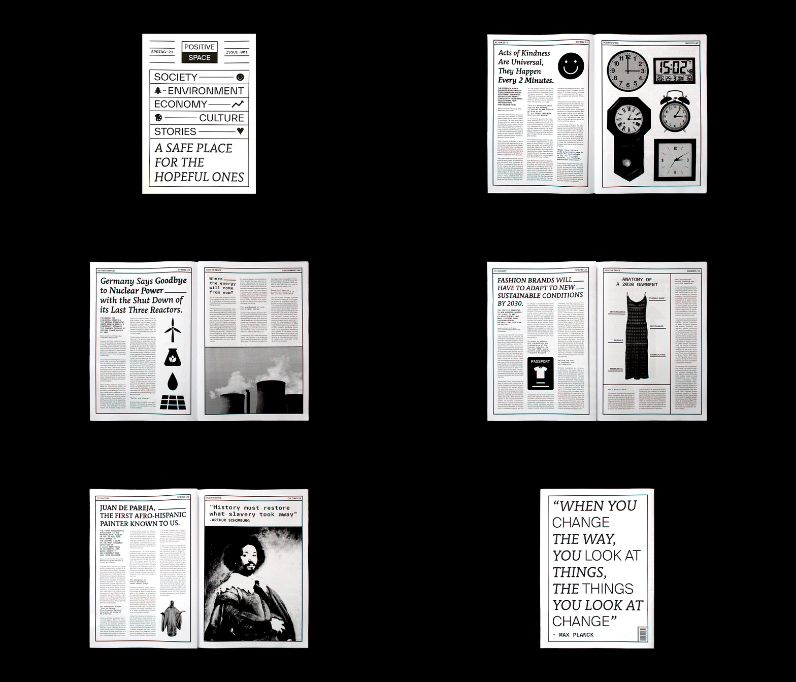
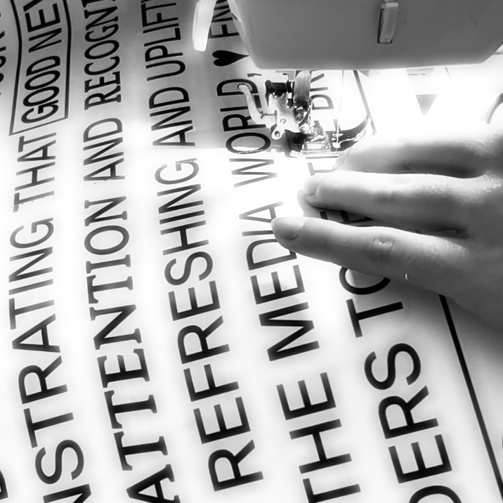
Positive Space is a newspaper focused on
the dissemination of good news in order to reduce the anxiety caused by reading or listening to bad news. The objective of this is create a ‘place’ where these negative emotions and feelings are put aside, bringing a more optimistic view of society.
The color strategy followed to highlight this concept of positivity consists of using the positive mode (black on black) when talking about optimistic topics, and on the contrary, the negative mode (white on black) when talking about negative facts.
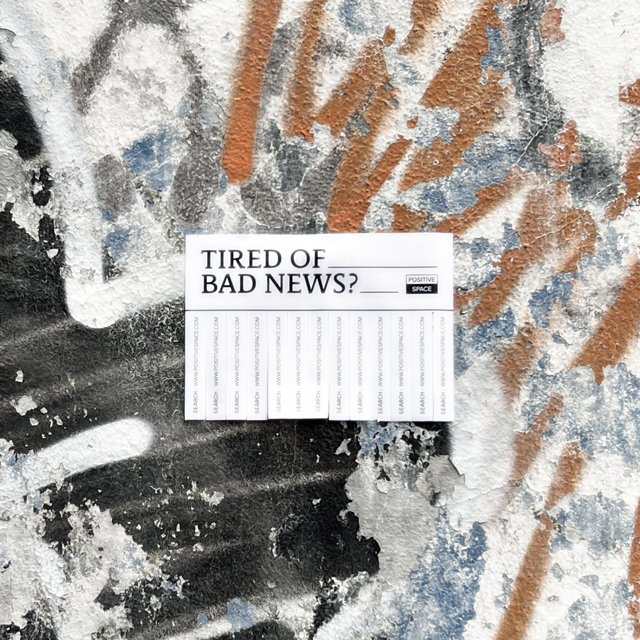
This last concept will be more noticeable in product communication, such as spots or resources for social media.
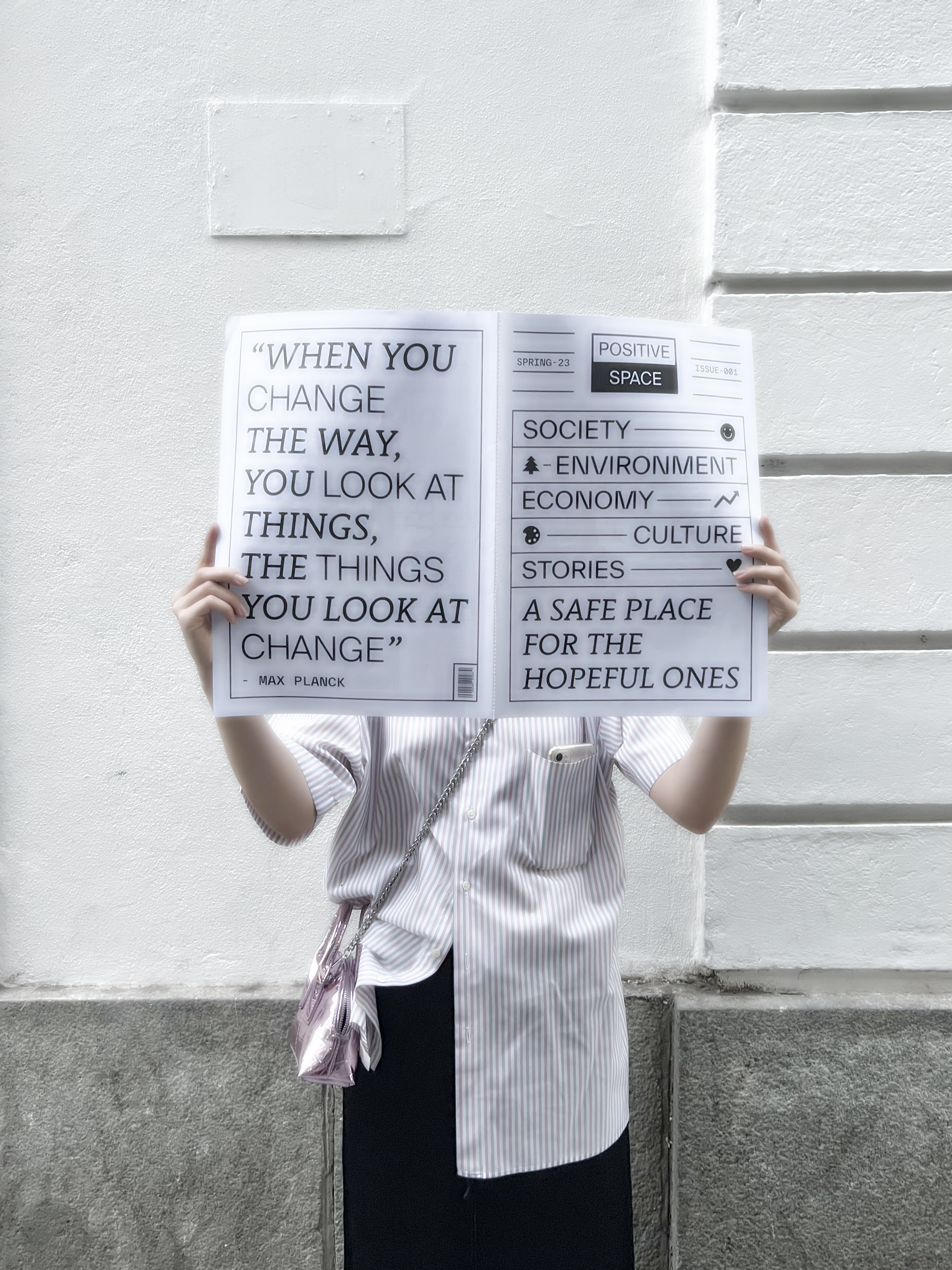
It is important to highlight the idea of large format in both, the newspaper and the
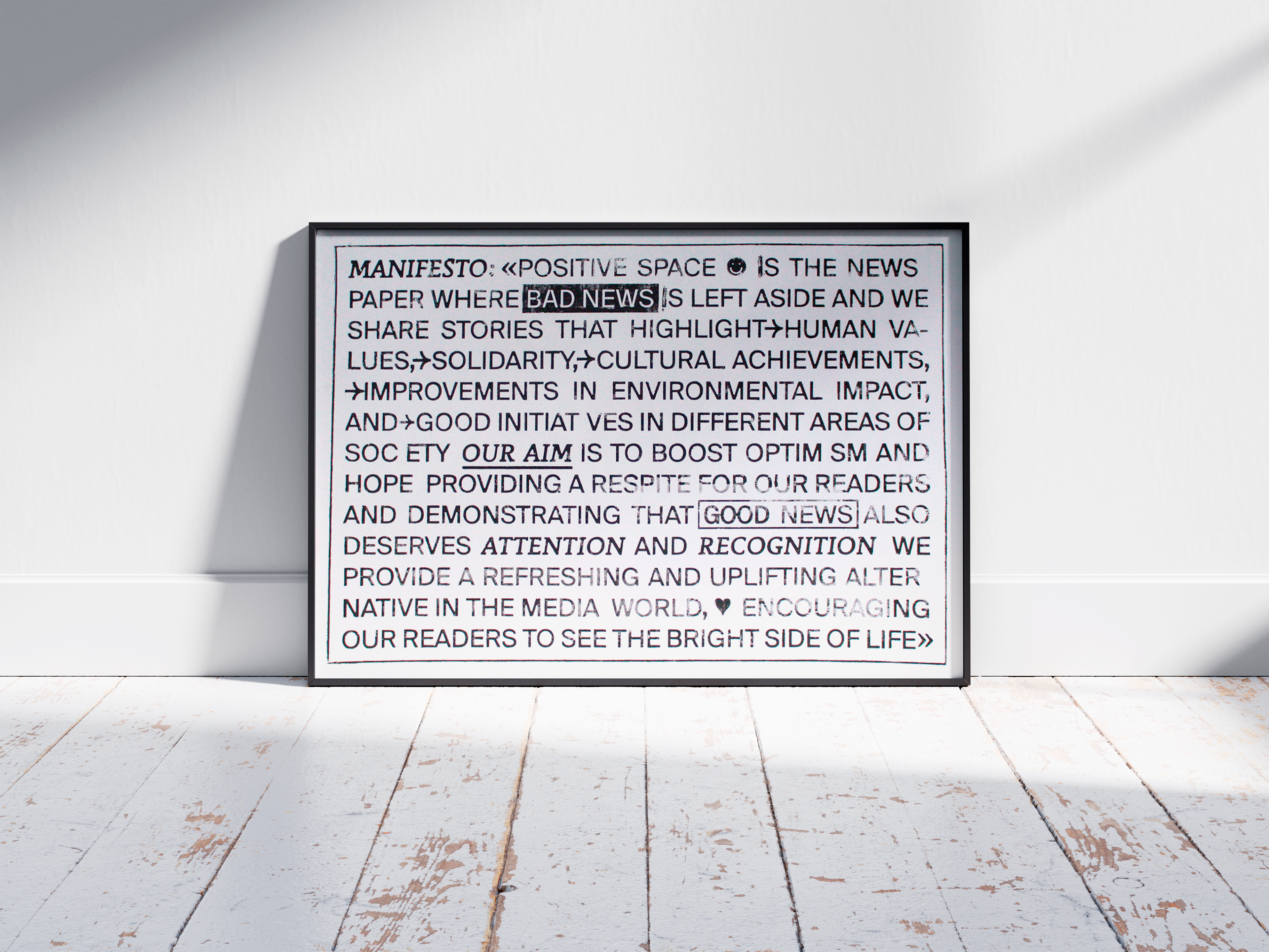
posters made with the technique of
letterpress, as the aim of this is to give
greater visibility to good news.


